Branding
Imprint - Brand & Logo
Brand identity and mark design for a manifestation app.
Year :
2026
Industry :
Health & Wellbeing
Client :
Imprint
Project Duration :
18 Hours

Imprint
A manifestation app built to help people turn intention into a daily habit, and the wordmark and identity designed around that shift from wanting to doing.

Where the Brand Lives
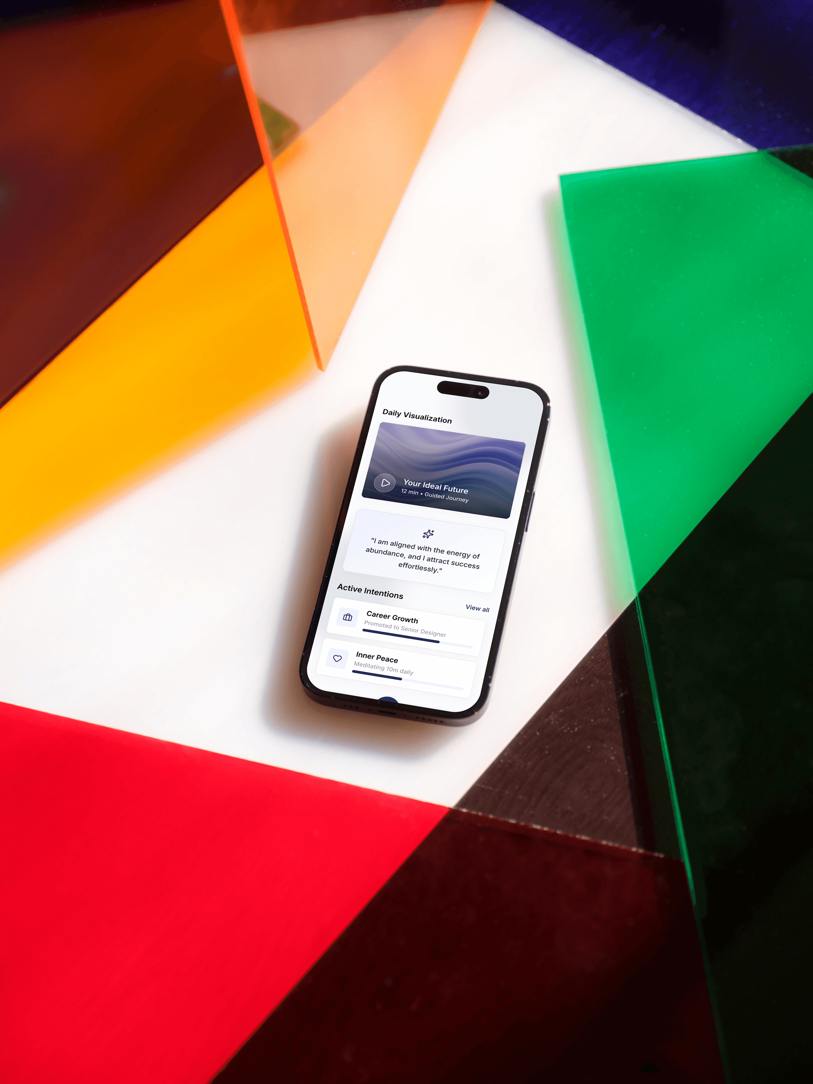
Before the visual system, a simple question: what does this look like in someone's hand, on an ordinary morning? That question shaped every decision that followed, from color to tone to how quiet the mark needed to be.

A Signature, Not a Logo
The wordmark leans into script rather than a conventional logotype, closer to a signature than a corporate mark. It's designed to feel personal, like something written by hand and meant for one person, not mass-produced for a market.

Soft Gradients, Held Together
The palette moves through warm pinks, soft blues, and lilac, never landing on one fixed color. That fluidity is intentional: the brand needed to feel like a mood, not a fixed identity, aspirational without tipping into cliché wellness-app pastels.

More Projects

Branding
Imprint - Brand & Logo
Brand identity and mark design for a manifestation app.
Year :
2026
Industry :
Health & Wellbeing
Client :
Imprint
Project Duration :
18 Hours
Imprint
A manifestation app built to help people turn intention into a daily habit, and the wordmark and identity designed around that shift from wanting to doing.
Where the Brand Lives
Before the visual system, a simple question: what does this look like in someone's hand, on an ordinary morning? That question shaped every decision that followed, from color to tone to how quiet the mark needed to be.
A Signature, Not a Logo
The wordmark leans into script rather than a conventional logotype, closer to a signature than a corporate mark. It's designed to feel personal, like something written by hand and meant for one person, not mass-produced for a market.
Soft Gradients, Held Together
The palette moves through warm pinks, soft blues, and lilac, never landing on one fixed color. That fluidity is intentional: the brand needed to feel like a mood, not a fixed identity, aspirational without tipping into cliché wellness-app pastels.
More Projects
Branding
Imprint - Brand & Logo
Brand identity and mark design for a manifestation app.
Year :
2026
Industry :
Health & Wellbeing
Client :
Imprint
Project Duration :
18 Hours
Imprint
A manifestation app built to help people turn intention into a daily habit, and the wordmark and identity designed around that shift from wanting to doing.
Where the Brand Lives
Before the visual system, a simple question: what does this look like in someone's hand, on an ordinary morning? That question shaped every decision that followed, from color to tone to how quiet the mark needed to be.
A Signature, Not a Logo
The wordmark leans into script rather than a conventional logotype, closer to a signature than a corporate mark. It's designed to feel personal, like something written by hand and meant for one person, not mass-produced for a market.
Soft Gradients, Held Together
The palette moves through warm pinks, soft blues, and lilac, never landing on one fixed color. That fluidity is intentional: the brand needed to feel like a mood, not a fixed identity, aspirational without tipping into cliché wellness-app pastels.